 Art Data
Art Data allows you to create 2 types of tables and 12 types of charts. Custom templates can be created to control the look of your tables and charts. Quickly populate a table or chart using our built in dataset spreadsheet or you can load a dataset from SQL Query, HTML or CSV file.
Creating a Multi-series, Custom SQL Query Chart Visualization
Note: This guide only covers Art Data v2.2.0 and above. If you haven't migrated to minimum Art Data v2.2.0 yet, please make sure to get the latest version and complete the migration. For more information about the scope of differences between Art Data v2.2.0 and previous versions please see here.
This article will teach you how to create a multi series chart using Art Data and custom database queries so we can populate a chart with data retrieved dynamically. This example can be applied to many different use cases such as building dynamic, interactive reports, or perhaps, a live dashboard.
In this example we're going to create a line chart that displays average monthly temperature data over 12 months for the year 1986 across four different U.S. cities: Dallas, Los Angeles, Miami and New York. After we're done we'll have a chart that resembles the image below.

Step 1
Let's get started by clicking the blue "+ new" button in the top right corner of your screen to create a new visualization and select the "Line" chart visualization from the visualization type select box. Go ahead and give the visualization a name and description so you can remember its purpose. I always turn off the "Show Title" toggle button as well because I like to give the chart it's own title and subtitle from the chart options area (more on this later).

Step 2
Now that we're done with the "Basics" area let's move down to "Data". This is where we're going to configure the data source for our chart visualization. Because we're creating this chart from SQL query we'll want to select "Custom" from the "Source Type" select box. Next select "SQL Query" from the "Source" select box. Then select "Multi Series" from the "Chart Series" select box. This will load the multi series name and sql fields and the ability to add as many series as you'd like. Click the "+ Add New Series" link to the right side of the window to create additional series for the chart.
For the sake of our example, the series are going to be each of the four cities: Dallas, Los Angeles, Miami and New York. Each series has a name: in our example the name of the city. Each series also has a separate SQL query so you can customize what data is returned for each series.


Step 3
We're now ready to write our SQL queries for each of our series. Below are our four tables. Each one contains data for a different city. In a well designed web application, this data could all probably be housed in one table but for this example we've split each city into it's own table.
Click through the gallery below to see the table structure.

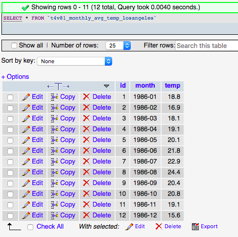


Our line chart is going to have four series: Dallas, Los Angeles, Miami and New York. We're going to need to write an SQL query for each city (4 separate SQL queries). In an earlier article we discussed the generalities of writing SQL queries in Art Data. The section titled "SQL and Charts" explains that charts work with name => value pairs. SQL queries for charts really need to SELECT 2 columns. The first column being the text/label such as a date or category and the second column being a numeric value. In our example, the first column is the year and month (1986-01, 1986-02 etc.) and the second column is the degrees celsius in temperature (22.10, 25.30 etc.). To create our line chart we need to write an SQL query that returns a list of records containing two columns of data, a month and the temperature value for each record.
Let's prepare our four SQL queries below so we're ready to input them into Art Data.
SELECT month, temp FROM t4v81_monthly_avg_temp_dallasSELECT month, temp FROM t4v81_monthly_avg_temp_losangelesSELECT month, temp FROM t4v81_monthly_avg_temp_miamiSELECT month, temp FROM t4v81_monthly_avg_temp_newyorkNow that our SQL Queries are ready for each of our cities we can create our series. Click the "+ Add New Series" link to the right side of the window and create three additional series so that we have four total. Enter the series names: Dallas, Los Angeles, Miami and New York and then for each series name enter its respective SQL query which we prepared earlier.

Step 4
The next step is to select a template for the chart. The template styles the chart - it controls things like the width, height, color palette, axis tick marks, borders and much more. To change the look and feel of a chart, adjust the template from your Joomla administrator > Components > Art Data > Templates. Navigate to the Chart templates. If you see an existing template you like, click the "duplicate" button to make a copy of it and then click into the copied template to start editing. Make any changes to the template you'd like and save it. It's always a good idea to create a separate template for certain charts.
In the below example we've created a new chart template called "Avg monthly temps" specifically for this chart.

Step 5
The last step is to customize the chart options in the "Other" area. Set the "Chart Orientation" to either Horizontal or Vertical. For this example we're going to use the "Vertical" option. Here you can also apply a chart title and sub-title which we had mentioned earlier at the beginning of this article.

Step 6
Finalize the chart options by adding a "Horizontal Axis Label" and a "Vertical Axis Label". Save the visualization. You can now click the "Preview" link to the right of your newly created chart visualization to see how it looks on the front-end of your site. To display this you can either add a new menu item of type Art Data > Visualization > Chart, deploying the Art Data module into one of your template available module positions, or by copy the Art Data shortcode listed next to your new visualization in your Joomla administrator > Art Data > Visualizations area and pasting it into an article or a custom module on your site.

All done!
Here's our finished product.
 Other articles in this category...